
Drawing Support and Resistance: Levels That Actually Hold

📚 Price Action Trading Mastery — Part 2 of 15
- Part 1: Price Action Trading 101: Reading the Chart Without Indicators
- Part 2: Support and Resistance: How to Draw Levels That Actually Hold (you are here)
⚡ Key Takeaways
- Support and resistance are dynamic zones of institutional order flow, never single-digit lines on a chart.
- The strongest levels originate from the weekly and daily charts, which dictate intraday price reaction.
- Draw your zones using candlestick bodies for the core zone and outer wicks for the maximum depth.
Most retail traders draw lines across every swing high and low, turning their charts into an unreadable spiderweb. This chaotic approach leads to constant second-guessing and false breakouts. Welcome to Part 2 of our Price Action Trading Mastery series, where we solve this frustration by shifting your perspective from thin lines to high-probability institutional zones.
In Part 1, we covered how to read clean charts without indicators. Now, we will build on that foundation by mastering the exact mechanics of drawing key levels that major institutions actually respect.
The Mechanics of Order Flow: Why Support and Resistance Exist
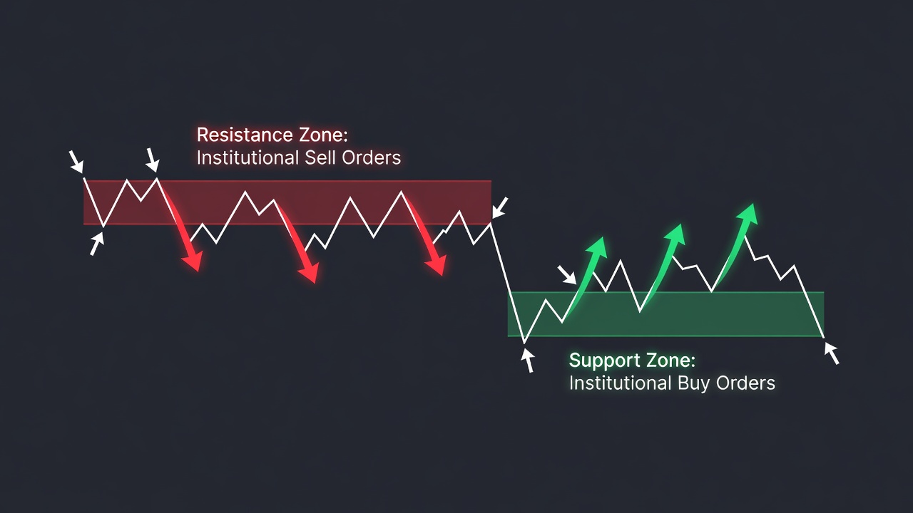
Support is not a magical floor, and resistance is not a physical ceiling. These levels exist solely because of supply and demand imbalances created by large institutional limit orders.
When a major fund wants to buy 5 million shares of an asset, they cannot execute the trade at once without spiking the price. Instead, they scale into their position within a specific price zone, creating a massive pocket of demand that halts downward momentum.
When price returns to this zone, unfilled institutional buy orders are triggered, causing the market to bounce. Resistance works exactly the same way, but with massive blocks of institutional sell orders capping upward advances.
The Step-by-Step Guide to Drawing High-Probability Zones
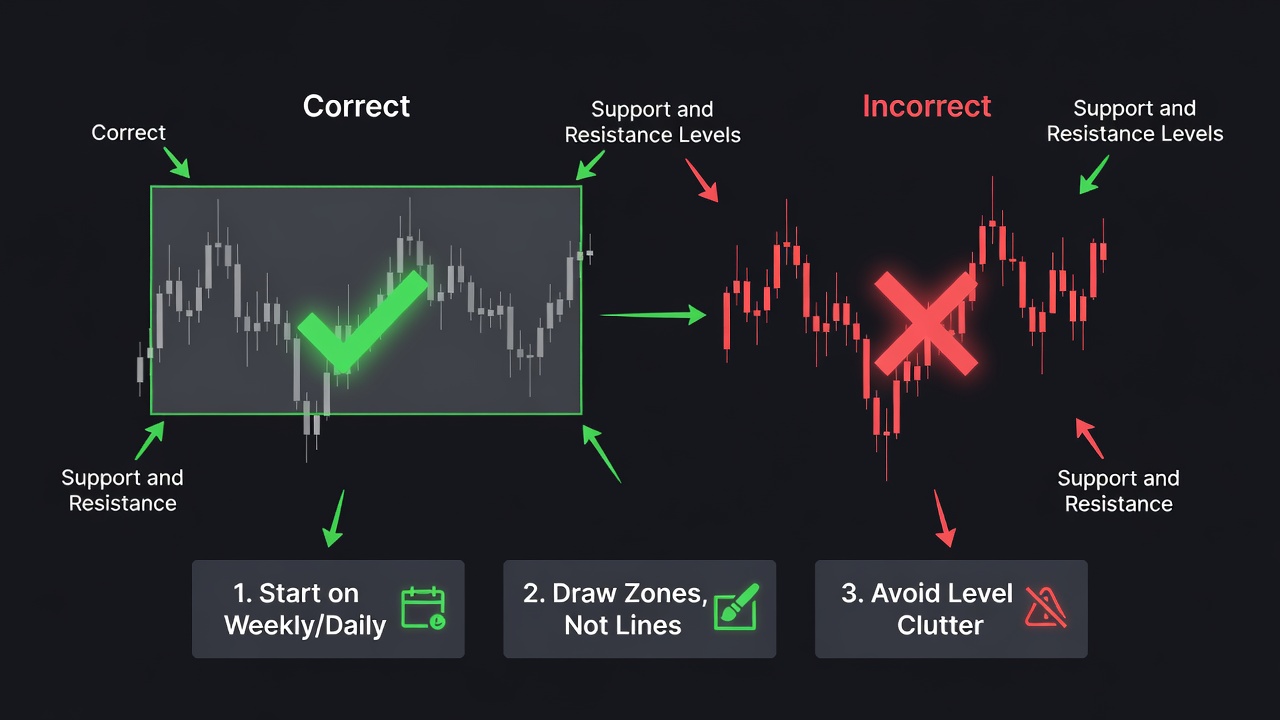
To find where the real money is waiting, start on the weekly chart to locate major structural turning points. Once you identify these macro levels, drop down to the daily chart to refine the boundaries of your zone.
Never draw single lines; instead, draw rectangular zones that capture both the candle bodies and the wicks. The candle bodies represent the real closing value agreed upon by the market, while the wicks represent extreme liquidity sweeps.
🎯 Get High-Probability Trade Setups — Free
The Big Dipper Dashboard delivers curated trade ideas straight to your screen every morning. Know what to watch before the opening bell.

Start your zone at the candle body close and extend it to the outer edge of the wick extreme. This creates a buffer zone that prevents you from getting stopped out prematurely during minor intraday spikes.
A Real Trading Example: The SPY Bull Call Spread at Key Support
Let us look at a practical options setup when price tests a validated daily support zone. Imagine the SPY ETF has retraced back to a major daily support zone spanning from $618.00 to $620.00.
Instead of buying shares, we will trade a high-probability vertical bull call spread to leverage this structural level. We buy the $620 strike call option for $8.40 and simultaneously sell the $630 strike call option for $4.10.
This trade structure results in a net debit of $4.30, which represents our maximum risk. The maximum profit potential is $5.70, and the trade reaches its breakeven point at $624.30 at expiration.
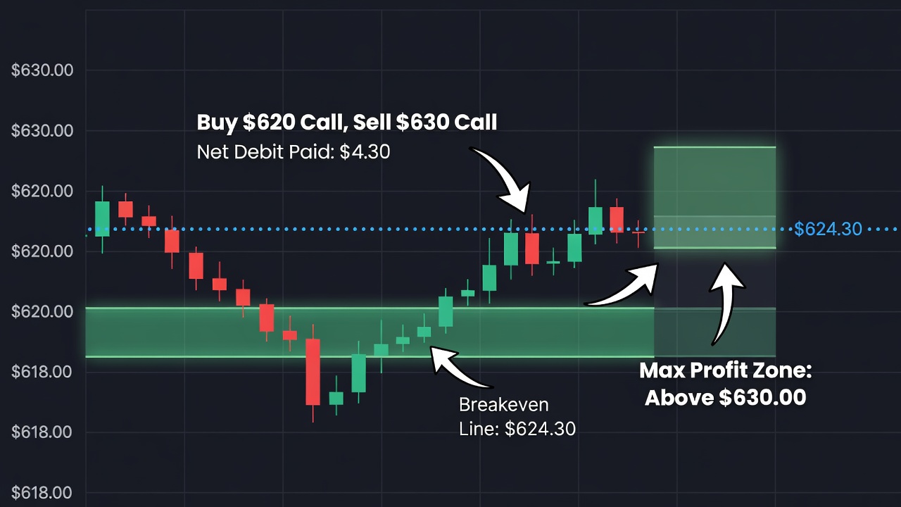
The math behind this setup is straightforward and structured to limit risk. The following table outlines the payoff structure for this support-based options trade:
| Metric | Calculation | Value |
|---|---|---|
| Net Debit / Max Risk | Premium Paid ($8.40) – Premium Received ($4.10) | $4.30 ($430 per contract) |
| Max Profit | Width of Strikes ($10.00) – Net Debit ($4.30) | $5.70 ($570 per contract) |
| Breakeven Price | Long Strike ($620.00) + Net Debit ($4.30) | $624.30 |
This options strategy allows us to utilize the structural support zone to define our risk. If SPY holds our $618.00 – $620.00 zone and bounces as expected, the options spread will rapidly build value.
Common Mistakes to Avoid
The most common mistake is drawing too many lines on your chart. If you have lines spaced every five points, you will freeze up and fail to execute trades due to analysis paralysis.
Another critical error is expecting price to reverse exactly at a specific price point. Remember that support and resistance are deep pools of liquidity, not razor-thin barriers.
Finally, avoid trading minor levels that only appear on lower timeframes like the 5-minute chart. These levels lack institutional weight and are easily broken by normal market noise.
Frequently Asked Questions
How do I know if a support level is strong?
A support level is strong if it has historically caused rapid, high-momentum price rejections on the daily or weekly charts. The fewer times a level has been tested recently, the more latent buy orders are typically waiting there.
Should I draw support levels from the wicks or bodies?
You must draw your levels using both elements to create a comprehensive zone. Use the candle body closes to mark the inner boundary of your zone and the wick extremes to mark the outer boundary.
Do support levels become weak after multiple tests?
Yes, support levels weaken with subsequent touches because each test fills and consumes the outstanding institutional buy limit orders. After multiple tests, the liquidity is completely depleted, leading to a breakout.
In the next part of this series, we will explore the specific price action trigger that signals these zones are ready to hold: The Pin Bar Reversal: Rules, Confirmation, and Real Entry Examples.
📈 Want More? Join Our Free Trading Community
- Trading Strategy Guides Telegram — daily strategy tips and market insights
- Find Better Trades Telegram — free trade signals delivered to your phone
- Find Better Trades on YouTube — live trade breakdowns and tutorials